


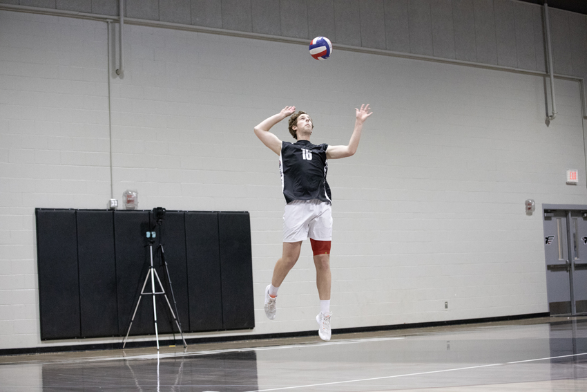

![[Video] New York Day 4](https://thefeather.com/wp-content/uploads/2024/04/NY-trip-day-4-JC-.jpg)
![[Video] New York Day 2](https://thefeather.com/wp-content/uploads/2024/04/NYCfeaturephoto-800x1200.jpg)
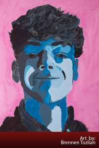
Monochromatic portrait art by Brennen Tozlian
The Feather Featured Art series is chosen by art teacher Vickey Belmont from her classes and/or independent art students. Belmont picks the best work during current units and encourages they students to participate in these occasional posts. Other students are encouraged to submit art pieces as well. Please contact the editors directly or via adviser Greg Stobbe for submissions.
Description: The monochromatic portrait is the final project in the color theory unit. After completing the color wheel the students were exposed to different color schemes, the monochromatic scheme is the culmination of the unit.
Sophomore Brennen Tozlian has completed the final project in the color theory unit: monochromatic portrait. He took a ‘selfie’ using a direct light source to create definite shadows. Later, using the grid method of transferring, he made an exact copy of his portrait.
Using the contrasts of the portraits, Tozlian and the other art students were to identify the areas and number them from a scale of one – nine, which relates to the value scale of a color. A value scale is the range of a color that starts with the lightest to the darkest of one particular color. The students picked a color or their choice and essentially painted their portrait as a paint by number.
The term monochromatic is a color scheme that uses various tones of only one color. Belmont uses it for this project as it takes away a lot of pressure to ‘get the right color’. She says most students are amazed at the finish product and that it actually looks like them. Belmont went on to say that she finds that this project restores confidence in students that have continually said they are not good at art.
A monochromatic color scheme, in theory, is defined by the use of only one Hue on the Basic Color Wheel, according to ColorWheelArtist.com. The website goes on to explain monochromatic color schemes with color theory and painting tips. The Art Tutor website offers help developing a grid drawing tool while StudioSilverCreek offers acrylic painting tips via a speed painting YouTube video.
Art teacher Vickey Belmont chose this month’s featured art and why she chose Tozlian’s example to post on The Feather.
“Brennen has challenged himself with every art project this year; he puts in a lot of time and effort with each assignment,” Belmont said. “He has done a great job with his portrait, using the monochromatic scheme showing the various tones of color. Brennan’s portrait is a good representation of what was expected for this assignment. He executed all aspects of this project and is one of many good portraits on display in the art room.”
Sophomore Brennen Tozlian
When I heard that we were doing a second self portrait, I was excited. The only part I wasn’t looking forward to was actually using paint instead of just drawing and shading the whole thing with just a pencil.
Right from the start, I was having trouble. We had to start the project by taking a selfie. Mrs. Belmont brought in this strange light so that our photo would have “exaggerated” features, highlights, and shadows. She told us to have a friend take the picture for us but I don’t really have any friends in this class, so I had to take it myself. Once I finally got one that didn’t look super creepy, I could finally start the actual drawing part.
We had to make a grid on a piece of foam board that matched a grid that Mrs. Belmont put over our pictures so that the drawing would be more precise. Then we had to fill in the blanks with a number that went along with how light or dark the color was. After I got my outline, I was ready to pick my color.
I was originally gonna do purple, but I ended up with blue because I really wanted to have that super light, baby blue color. Once I started painting, I realized that the paint wouldn’t brush on to the foam board very smoothly, so I had to layer over each color like three times! But in the end it was worth it.
Once I finished painting my face and all the shadows, I had to tackle the hardest part, my unruly hair. If I were smart enough to think ahead, I would have done my hair the morning I was going to take the picture. I ended up having to paint my crazy, fluffy, curly hair. However, it came out way better than I expected. After about a week of painting and repainting, I was finally ready for the background. I wanted to do a coral orange color, but I decided to do pink because it would pop better.
I’m really proud of this project and I’m glad it came out as good at I hoped it would.
For more art articles, read Featured art, No. 6, 2018-19, and check out Matthew Peterson’s color wheel art. For more on monochromatic portrait, check out The Smart Teacher and the monochromatic portrait paintings unit.

Faith • May 3, 2019 at 10:05 am
Wonderful Art Brennen!