


![[Video] 100th CSPA Spring Journalism Conference](https://thefeather.com/wp-content/uploads/2024/04/20240308-cspa-crown-002.jpg)
![[Video] New York Day 4](https://thefeather.com/wp-content/uploads/2024/04/NY-trip-day-4-JC-.jpg)

Visual presentations allow students to engage in comprehension process
Sixty five percent of people are visual learners. Because of this statistic, programs like Google Slides, PowerPoint and Prezi are used in classrooms to convey lesson plans. However, creating educational images is not only for teachers. Students can join in the visual education process by using graphics in the classroom to present their information in a professional way.
Infographics are visual representations of data or topics. Their goal is to present large quantities of information in an easy to understand and enjoyable image.
Though it may seem daunting to create an infographic, research, layouts and organization allow the infographic-making process to be simple and straightforward.
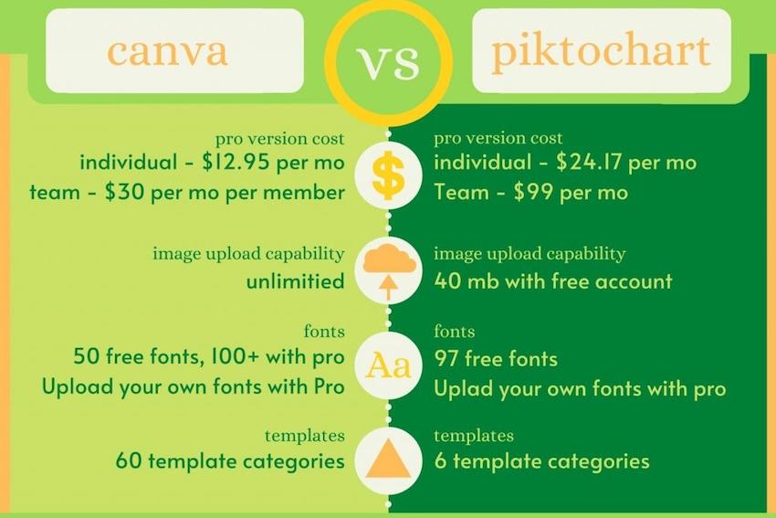
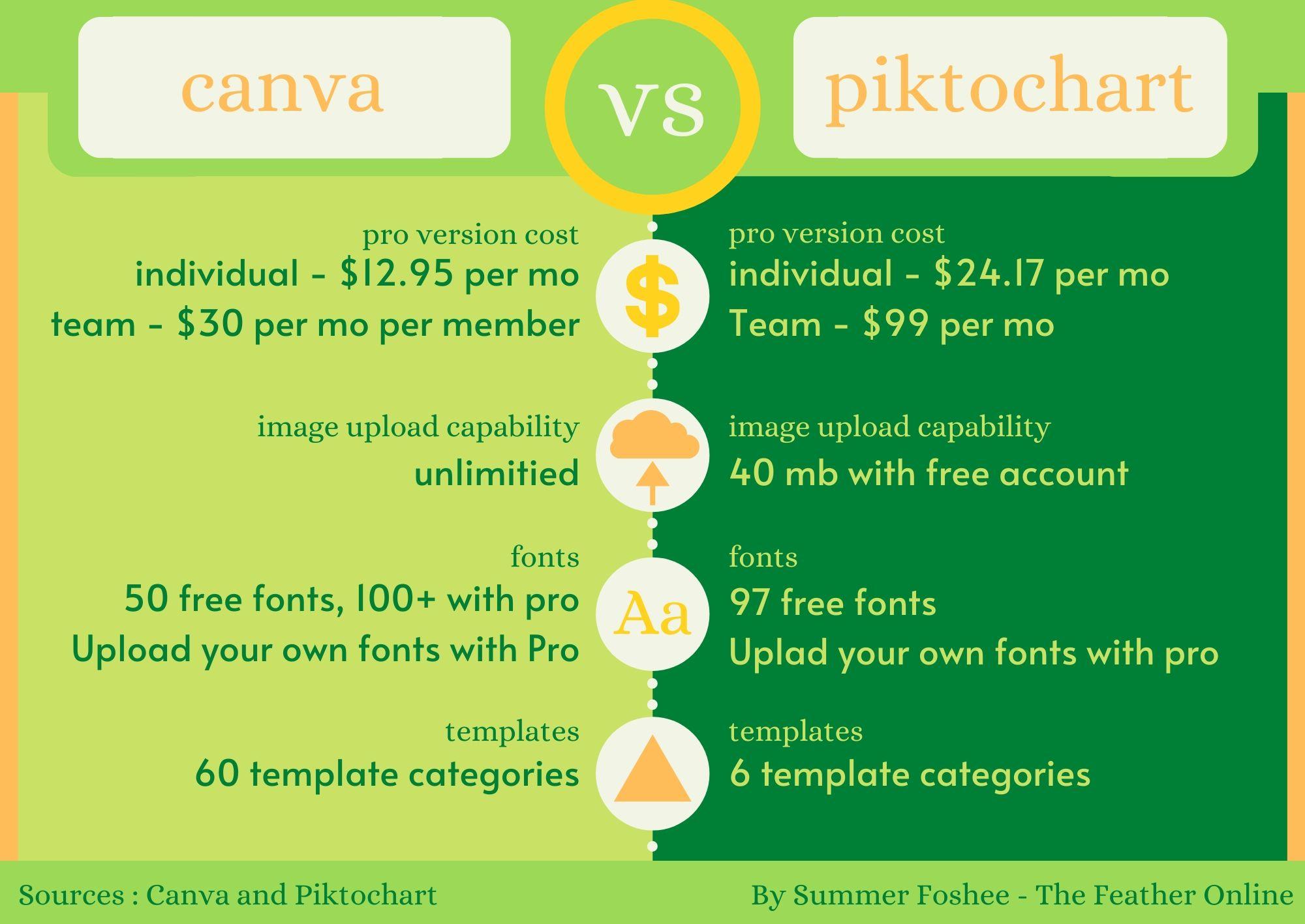
Before starting an infographic, log into a website of choice. After comparing multiple platforms, The Feather team chose to use Canva and has done so for two years. While a Canva account is free, special features can be unlocked by paying for the ‘pro’ version. These features, including extra fonts and icons, are helpful but not necessary to make an impactful infographic.
[media-credit id=139 align=”aligncenter” width=”1000″] [/media-credit]
When using Canva for infographics that go into The Feather articles, creators utilize “US Letter” template for the verticle infographics and custom dimensions (12×8.5) for horizontal infographics. Canva offers many other useful templates including social media posts, presentations and flyers.
[media-credit id=139 align=”aligncenter” width=”1024″] [/media-credit]
Choosing the right color palette can make or break an infographic, so choose carefully. First, it is important to do some research on what different colors symbolize as well as the mood they give off. For example, red stands for passion, romance, longing, wrath and willpower. It can invoke a feeling of urgency or importance in a piece as well as symbolize its theme. When choosing colors, it helps to know some basic color theory such as what colors go best with others.
[media-credit id=139 align=”aligncenter” width=”1024″] [/media-credit]
Various elements can also be added to help an infographic come together or to create a point. These elements can be found in Canva or other infographic making platforms. Not all programs are free or offer the same kinds of templates. Fortunately, there are ways to get around this.
By combining other elements to create new ones or using digital drawing apps, you can create your own. As far as free apps go, Draw Free and ibisPaint are easy to use. On the pricier side, Procreate creates smoother and more professional textures, costing $5-10 depending on the device.
[media-credit id=139 align=”aligncenter” width=”1024″] [/media-credit]
Make sure the fonts you choose are appropriate for the message you are trying to convey. This means bubbly fonts aren’t the best if you’re trying to convey a serious idea. Likewise, solemn fonts can dull otherwise exciting elements or colors.
Also, limit yourself to only 2-3 fonts in each design, as too many fonts can confuse a reader. Serif and sans serif tend to pair well. If you have trouble picking fonts that match, consider using Canva’s free font pairer.
[media-credit id=139 align=”aligncenter” width=”1024″] [/media-credit]
A vital step in creating a published graphic is by stating where the information came from. Plagiarism Today states, among other reasons, that one should cite their sources to “give credit where credit is due.” The way you can incorporate this into infographics is by placing the website, book or other sources, as well as your name and website, at the bottom 0f the infographic.
Once you finish your infographic, it is ready to be downloaded! In Canva, press the “download” button in the top right corner.
Infographics share information in a visually appealing way. If used with correct methods, viewers can better learn and remember the information you are attempting to communicate.
In the following podcast, Zoe Bull and Summer Foshee discuss how they started and Infographic team for The Feather Online
For more articles, read COLUMN: Freshman international student shares English language journey and Online community bridges separation amidst shelter-in-place mandate.


Silva Emerian • Mar 26, 2020 at 5:38 pm
Yesss Summer! Excellent article and accompanying visuals! I love all the graphics you’re creating. Keep up the awesome work.